BY KARIN FONG |
Title Designer Karin Fong Reveals the Secrets Behind Good Opening Credits
"I favor the title sequence that asks more questions than it answers." Emmy-winning movie and TV title designer Karin Fong shares her ideas about the job of the opening credits - and why the less obvious concept is often the best one.
I like to think of a title sequence as a bridge from everyday life into the world of the story.
Perhaps you are settling into your seat, your mind still on finding the parking spot, your fingers still unwrapping the candy. Or maybe you are watching at home, the cares of the workday world still with you when you tune in to an episode. That goes away as the first credit appears onscreen. It announces that another reality has begun. The title sequence becomes a passageway into the show. It says, “Pay attention now– you are leaving your everyday life behind.”
It’s the curtain that rises up, telling you to suspend your disbelief.
It’s the “Once upon a time…” that signifies a story is about unfold.
It’s a little preview of what the chef has prepared for the evening…or for the entire season ahead.
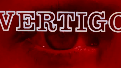
 I favor the title sequence that asks more questions than it answers. It’s the art of the tease, and the ones I envy most become even more satisfying when you revisit them later on. Think of the way the titles for Catch Me if You Can walk you through the entire movie, though of course you don’t fully realize what is happening the first time through. Or the way you just sense a certain significance to the objects that emerge from a cigar box in the opening of To Kill a Mockingbird.
The ideal main title, even when it provides aesthetic or emotional contrast to what follows, works within the whole. It might appear to be a “mini-film” but to be truly successful, it has work within the story’s arc. This point can be forgotten if you view a title just as a stand-alone piece.
Opening titles are an invitation. Good ones stir feelings of anticipation, making it easy for the viewer to join in.
I’m reminded of when we were designing the opening for the feature film Charlotte’s Web. This was for an adaptation of E.B White’s classic children’s book, in which a spider miraculously weaves messages within her web. The type was set within shimmery spider webs, which, in my mind, was the most natural and witty solution, and one that was very beautiful as well. But that was the last thing that director Gary Winick wanted to do. The moment it’s revealed that Charlotte has been spinning words is a key dramatic point in the story. Did we really want to waste the power of that image in the opening? Better to save it for its proper place in the narrative. For similar reasons, we chose not to introduce any of the animal characters in the beginning, saving them for their entrances in the plot, and for the final credits – a “roll call” to close the film.
Instead, we designed an opening sequence that gently introduces the idyllic farmland setting, created with drawings that evoked the print originals by Garth Williams. By not literally matching the film’s look (it was a live-action interpretation) the animated ink and watercolor landscape emotionally connects us with its storybook origins and at the same time eases us into the fable.
Opening titles are an invitation. Good ones stir feelings of anticipation, making it easy for the viewer to join in. This is true whether you are creating main titles for a feature film or a television series.
For TV, however, one isn’t so focused on a particular point in the script, since that changes with every episode. The challenge here is to make something that is simultaneously broad enough to remain intriguing for what might be many seasons, yet particular enough that it can’t play in front of any other show.
For those reasons, I’m a fan of show creators who push the use of metaphor, rather than use the titles to display an edited cast and clips. Why duplicate what you will see in the show that follows, when you have the opportunity to evoke a mood and pique curiosity through a more abstract approach?
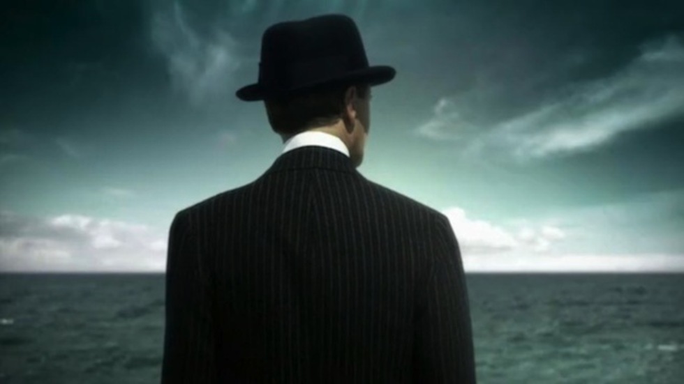
One of our original ideas for Boardwalk Empire was to shoot a montage of their gorgeous set and costumes; unique and detailed, they would no doubt visually set the stage. But that’s not what the story was really about. Creator Terry Winter and HBO really pushed us to go bigger with the concept, which in the end meant distilling the idea down to a central image that signifies the main character and the role of prohibition: a man on the shore, watching a sea of liquor bottles roll in. Admittedly a more enigmatic approach, but ultimately one that could that becomes more suggestive of the series as it evolves.
Every film or show does need a title sequence of some kind; it’s a given that at some point it will need to display the credits. In the same way a book has a title page and colophon, a film has legal information to include as well. Why not make this mandatory piece of the show a part of the storytelling? A title sequence can be a wonderful way of giving a taste of what will unfold, and in many cases, one that will be savored long after the lights go up.
Karin Fong directs and designs for the screen. A partner at design and production company Imaginary Forces, she’s created numerous sequences for television and feature film. Her reel includes the main titles for Boardwalk Empire, Charlotte’s Web, Terminator:Salvation, The Pink Panther 2, Hellboy, and Ray.
Among Karin’s accolades are five nominations and an Emmy for her work in main title design.